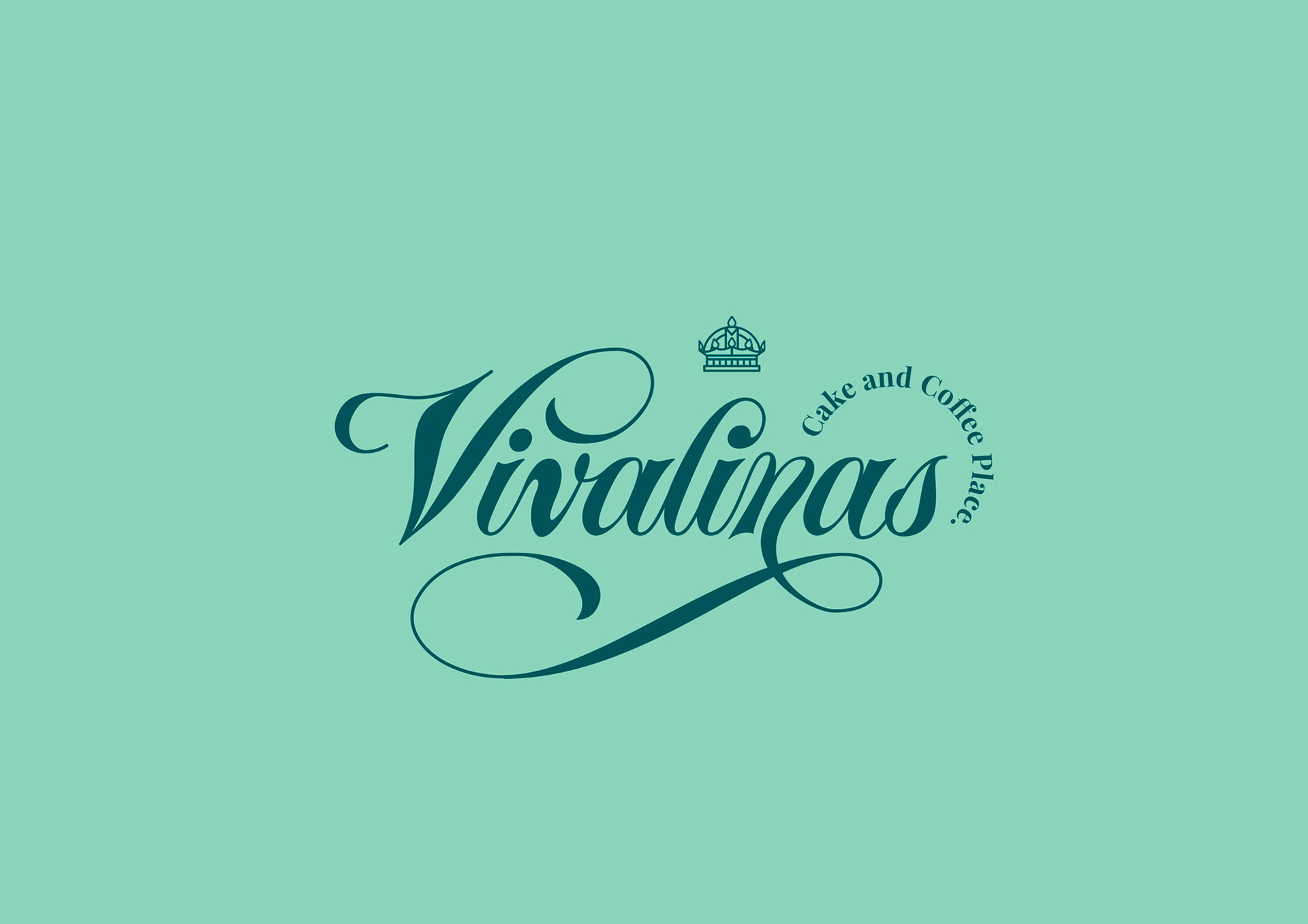
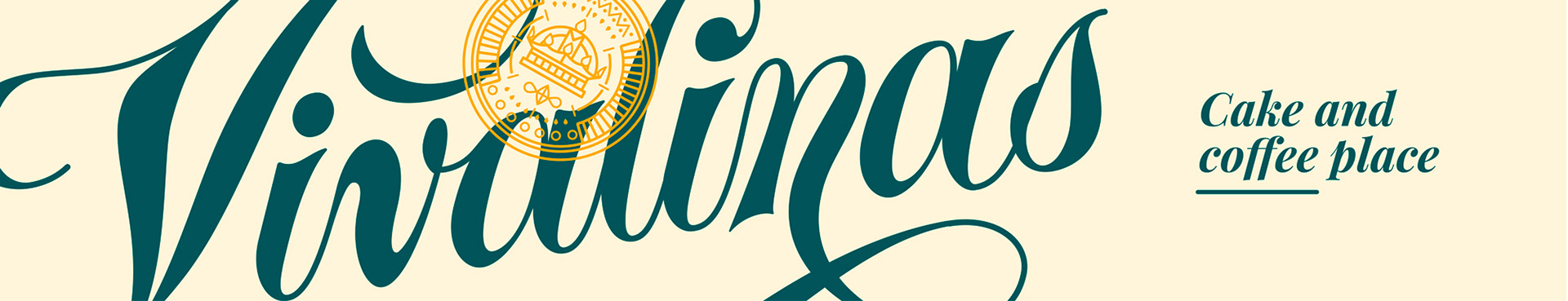
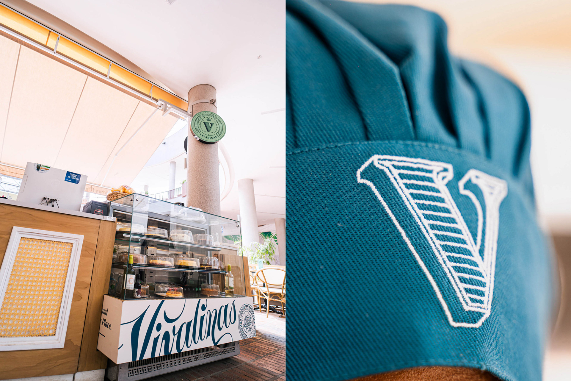
Vivalinas - Cake And Coffee Place
Redesign
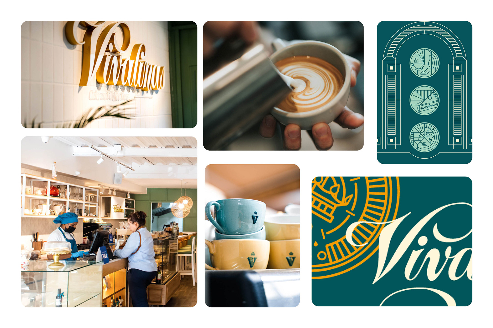
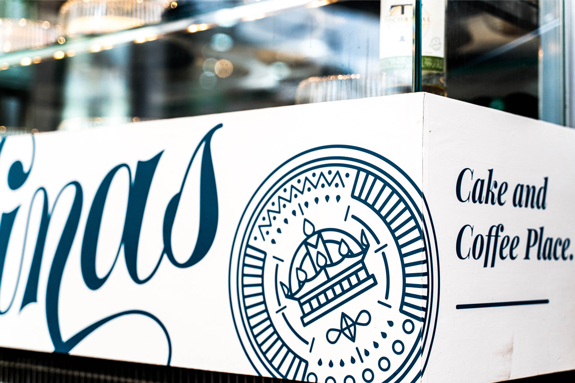
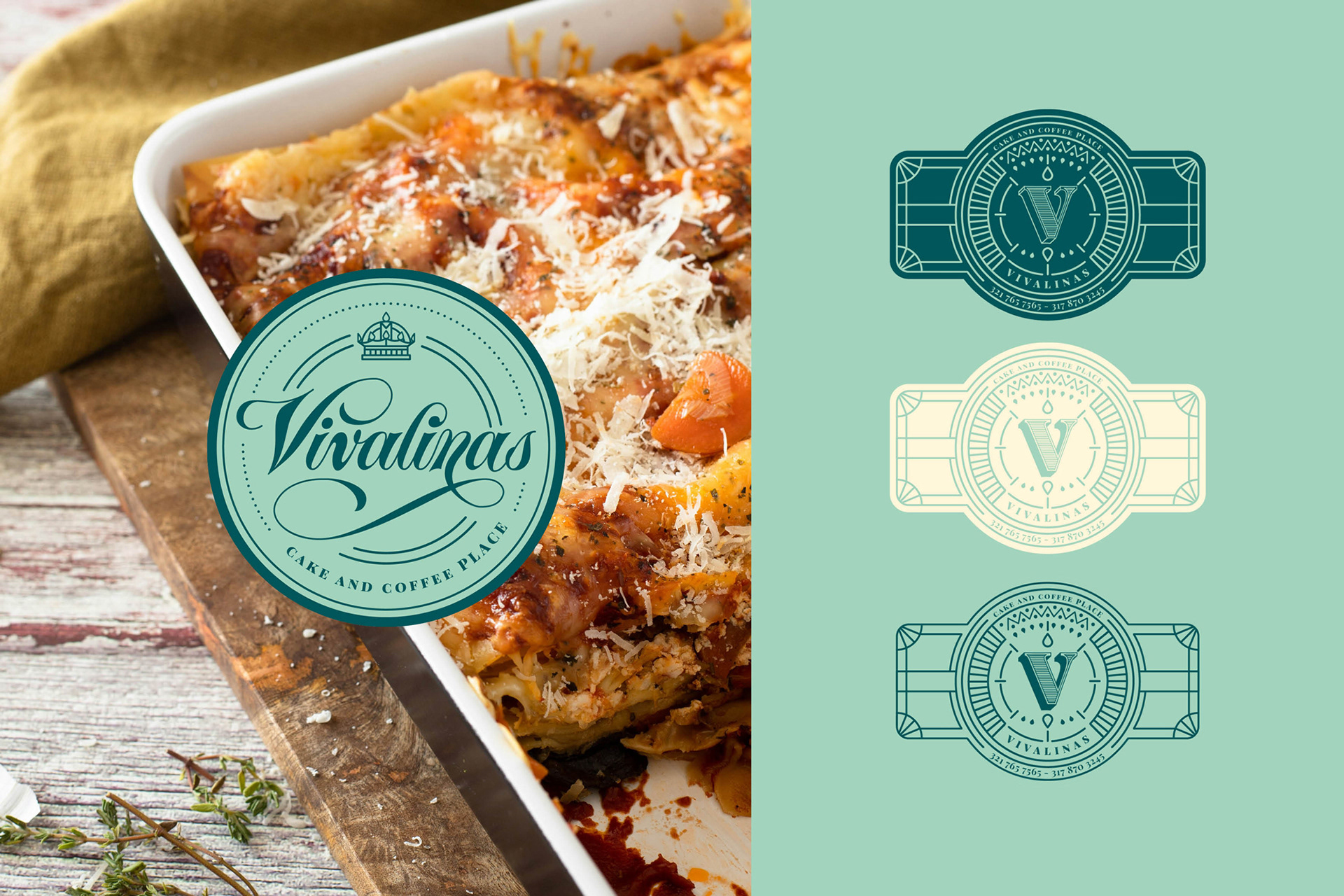
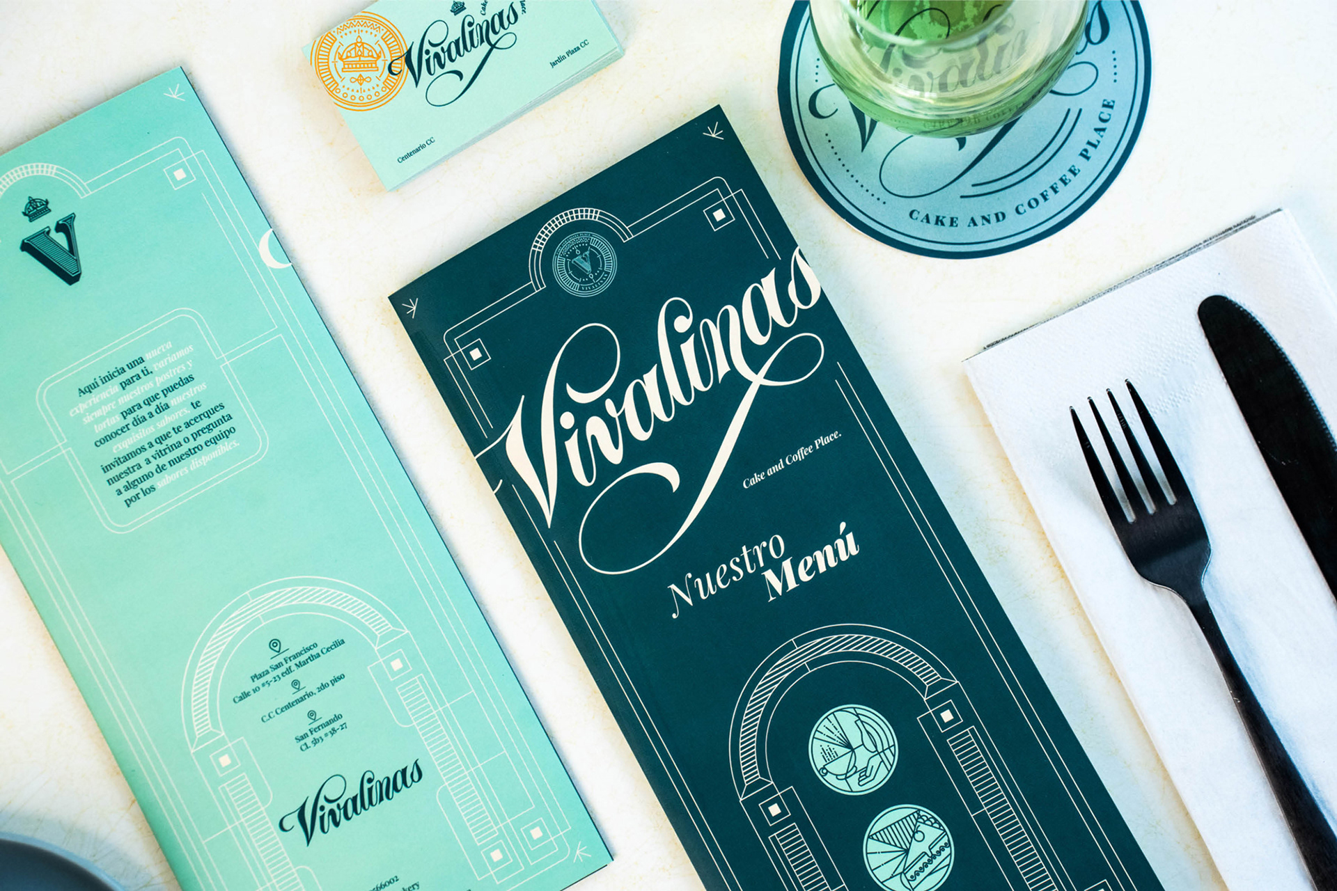
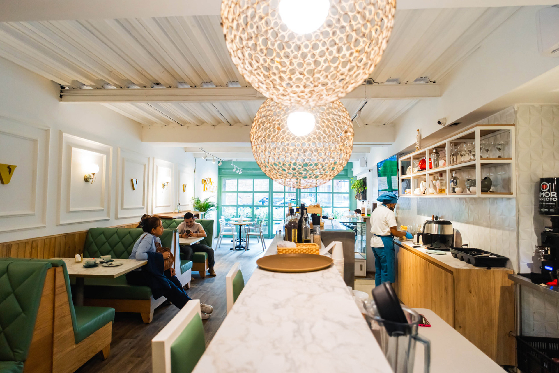
The new brand identity draws inspiration from the mid-20th century French art deco style, which is reflected in the emerald green and cream colors. The brand offers high-quality coffee, light meals, and indulgent desserts. As part of the rebranding, they have transitioned from a pastry shop to a coffee shop specializing in food and drinks. Cake And Coffee Place.
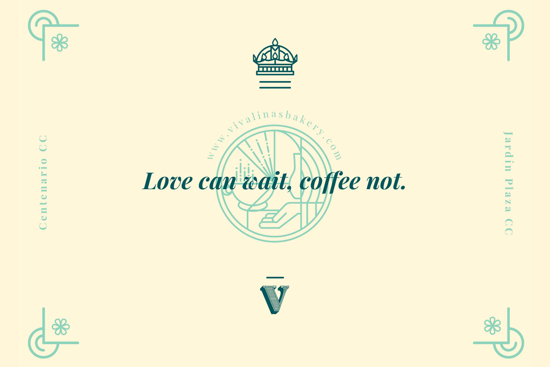
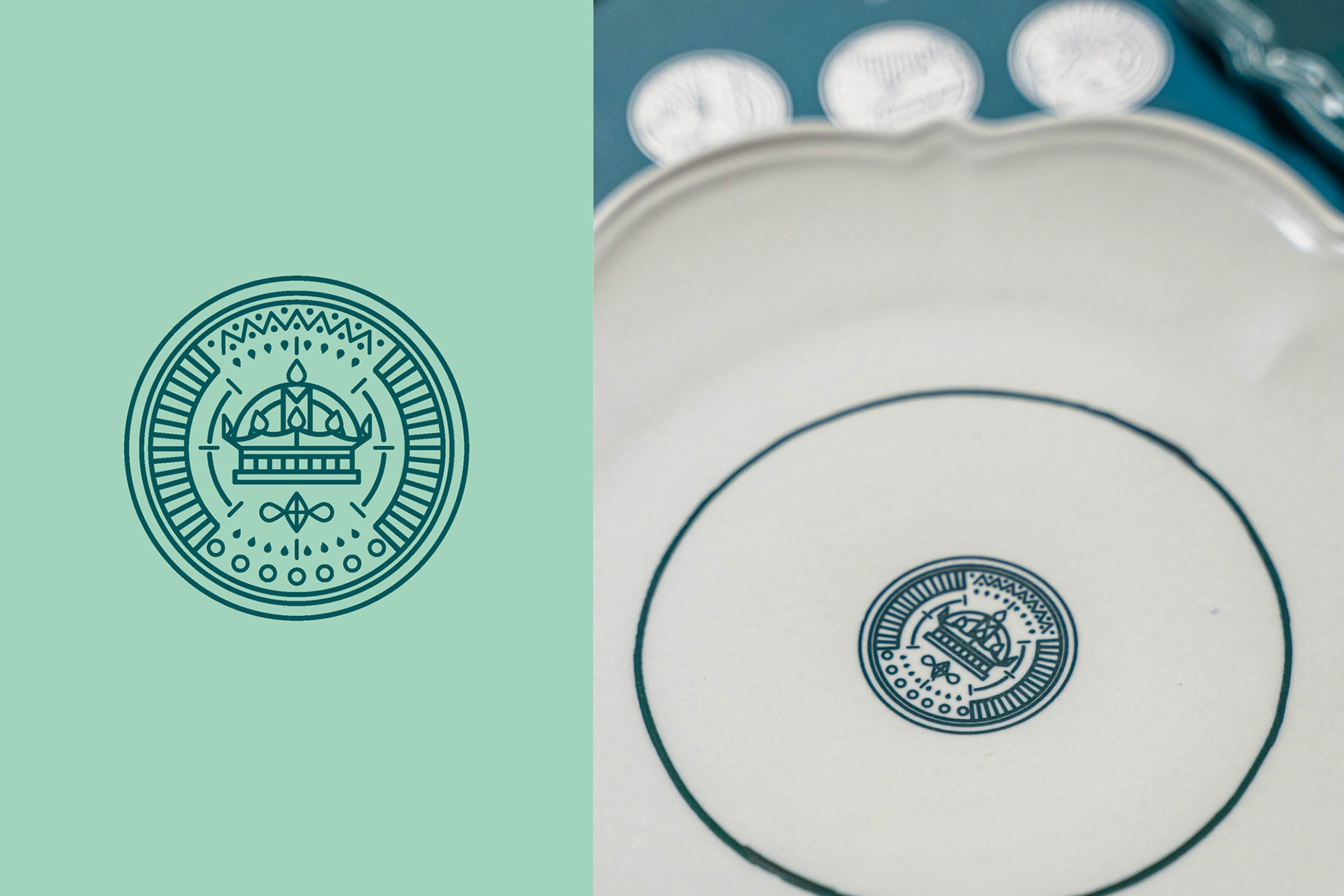
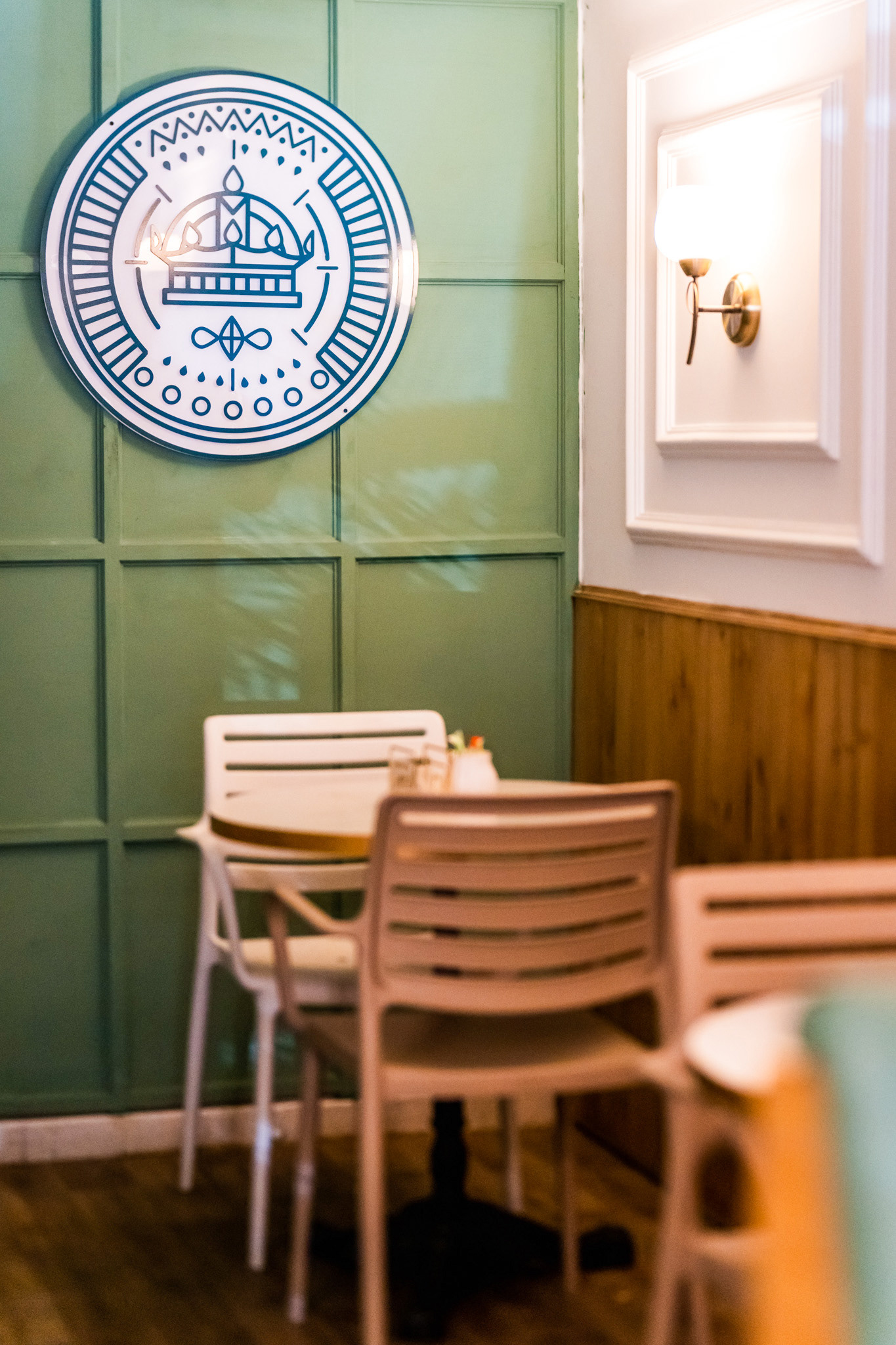
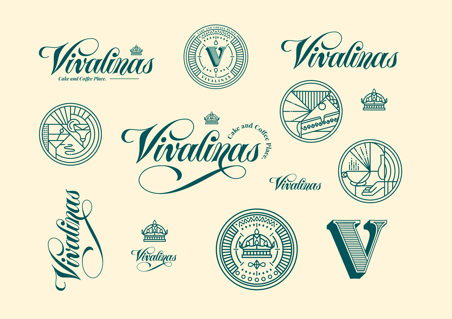
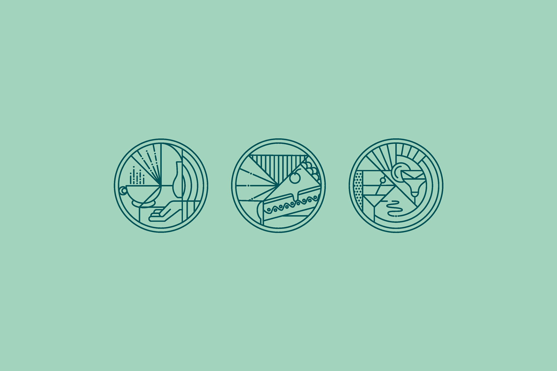
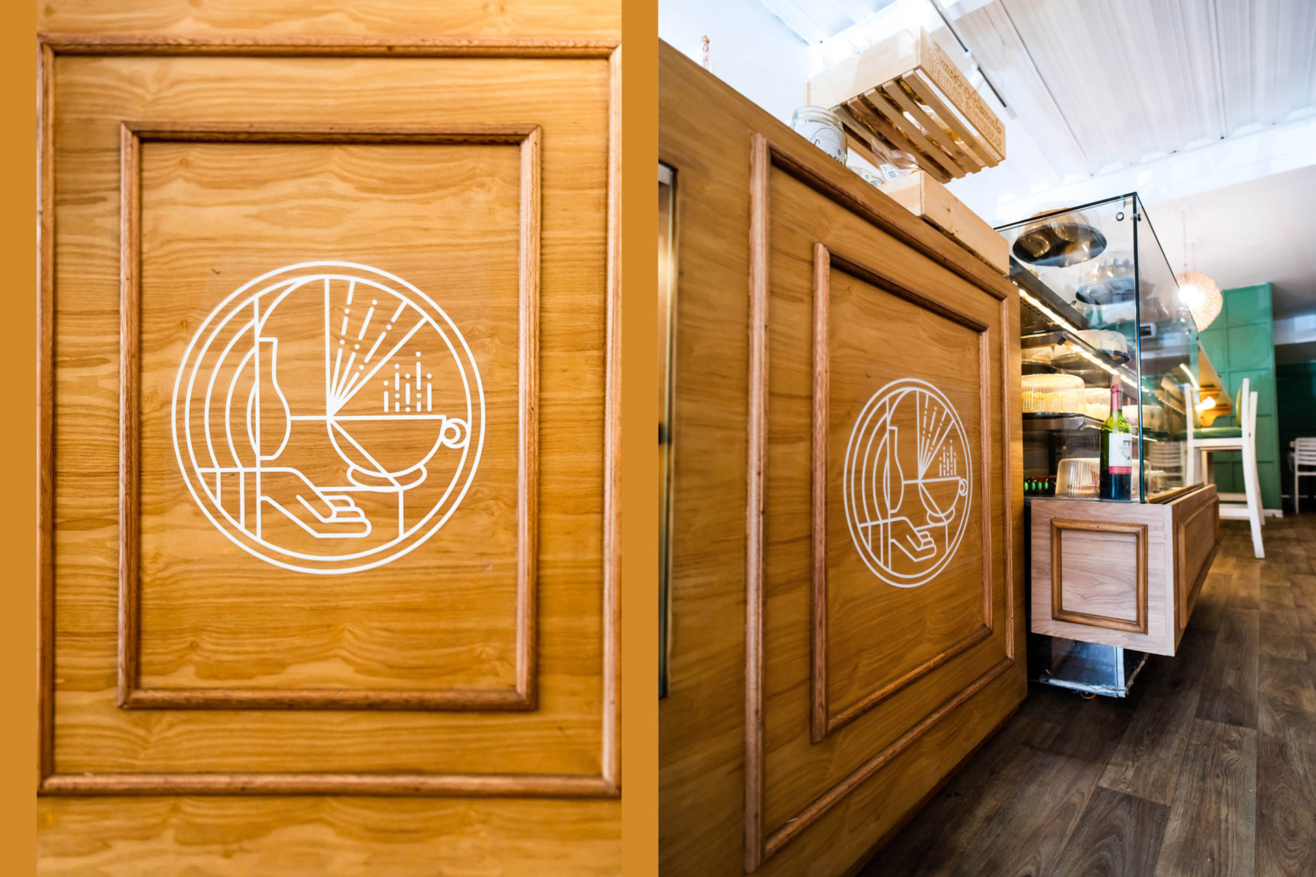
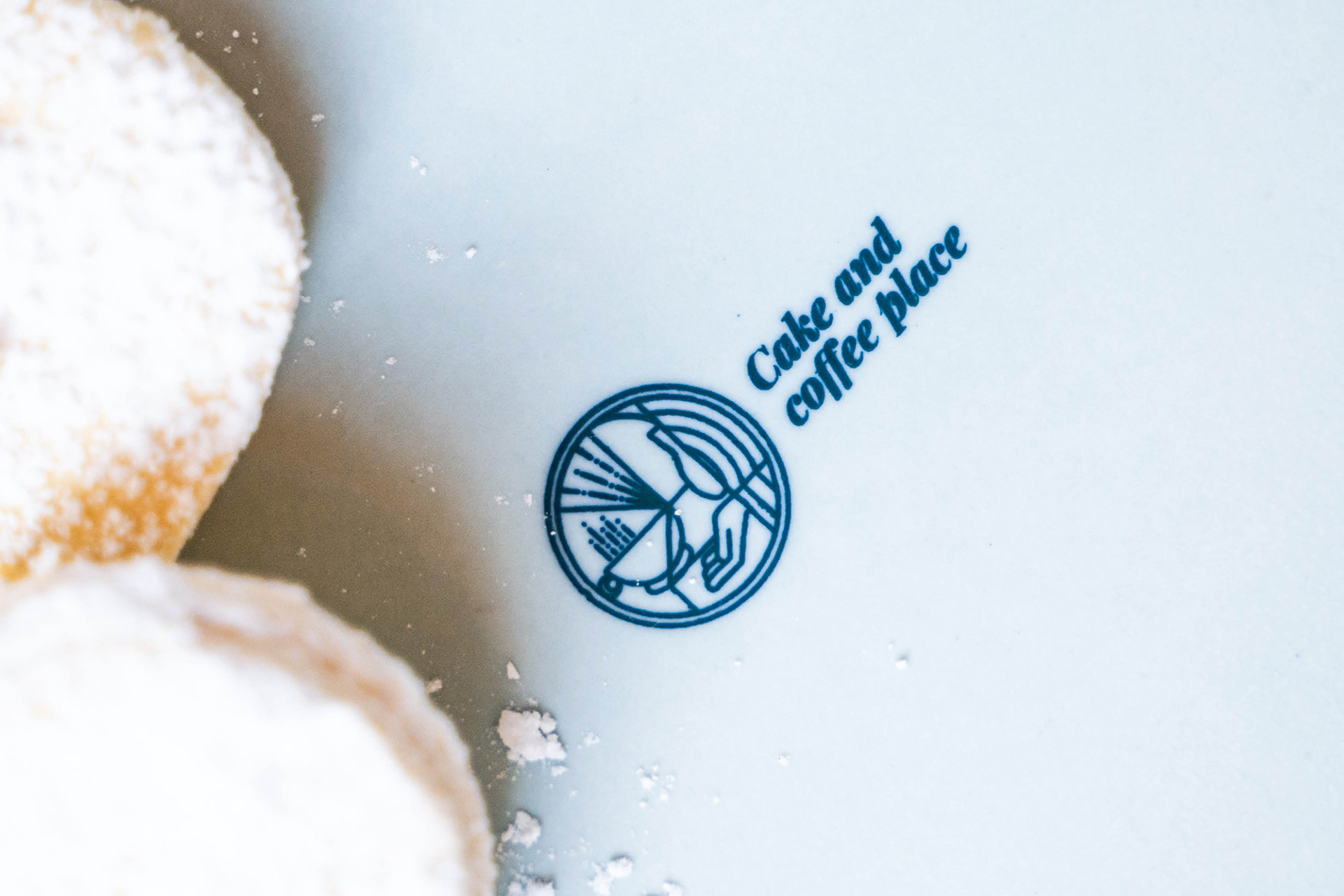
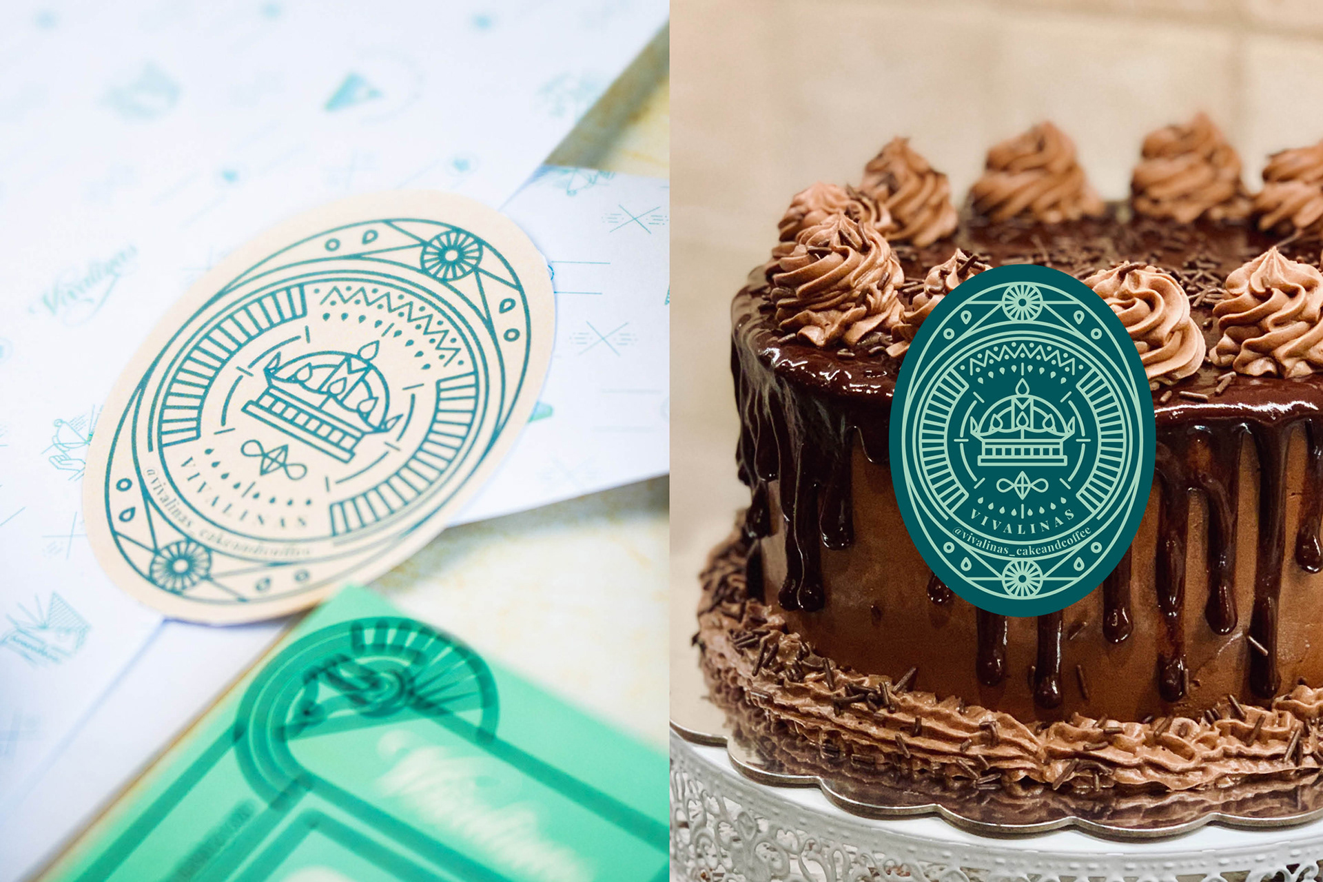
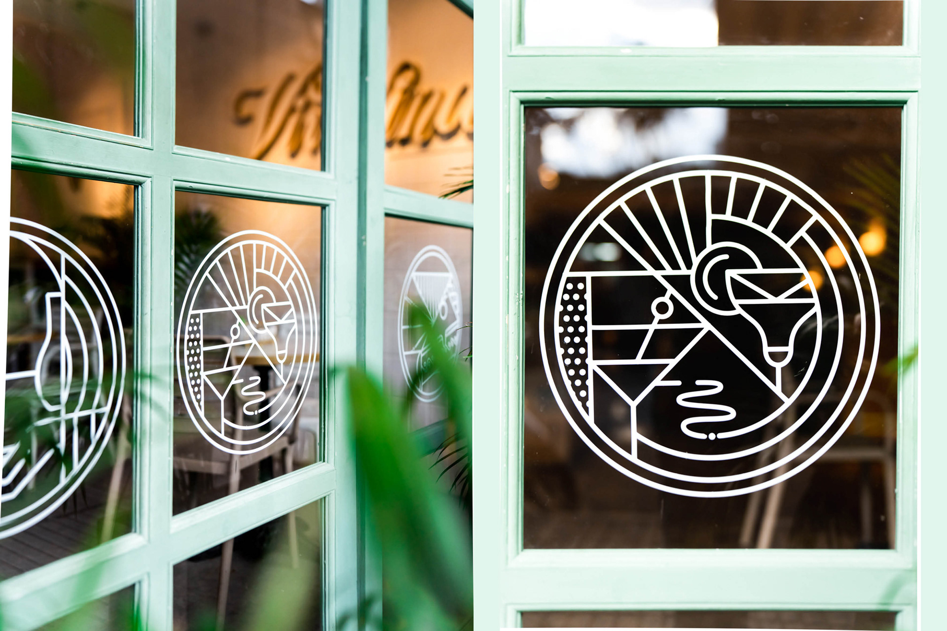
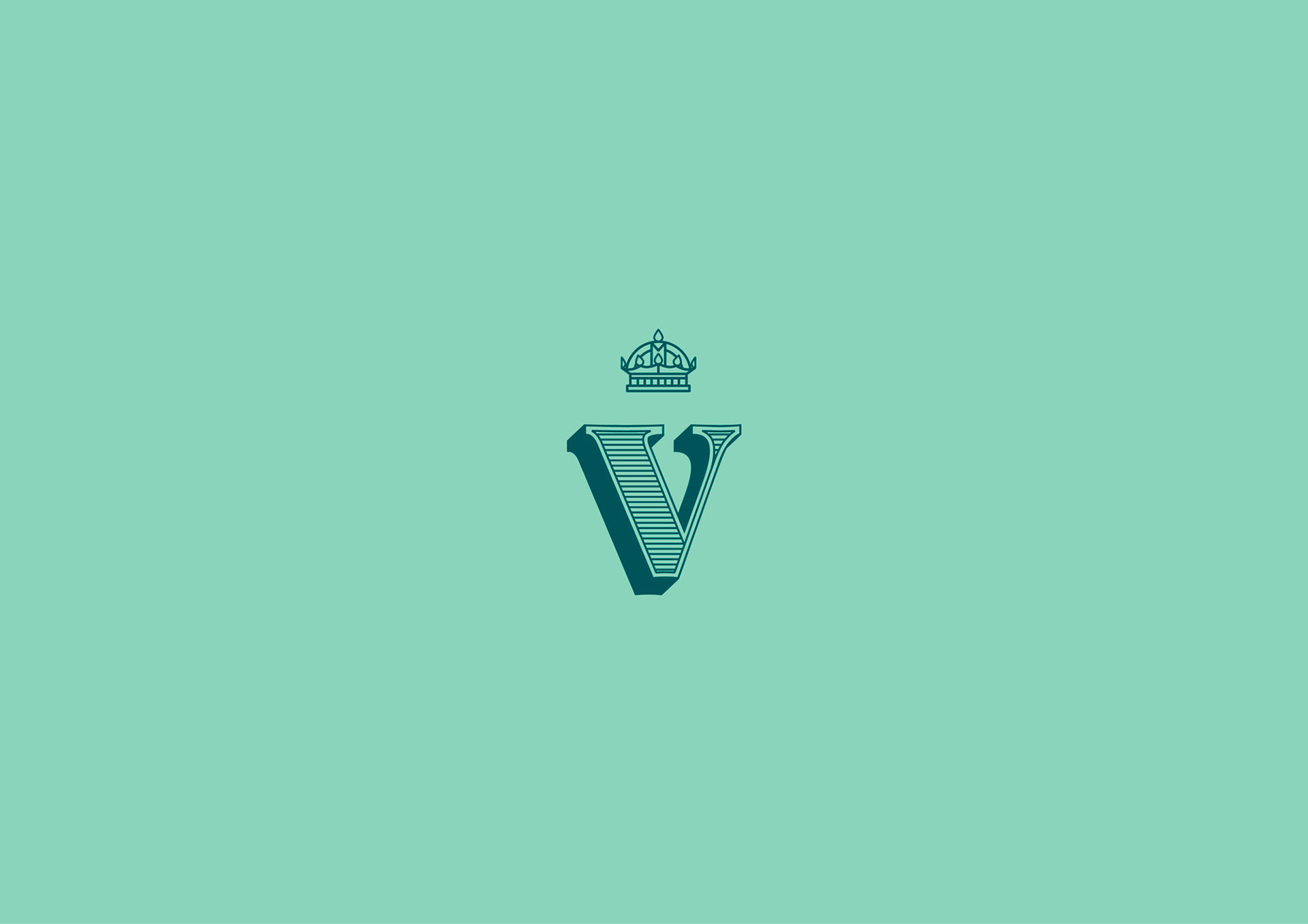
The main illustrations depict their offerings, such as cocktails, coffee, and sweets. Additionally, the crown symbolizes the elegance and luxury of their high-quality products. All elements are styled with the geometric and decorative flair of Art Deco, reminiscent of New York.
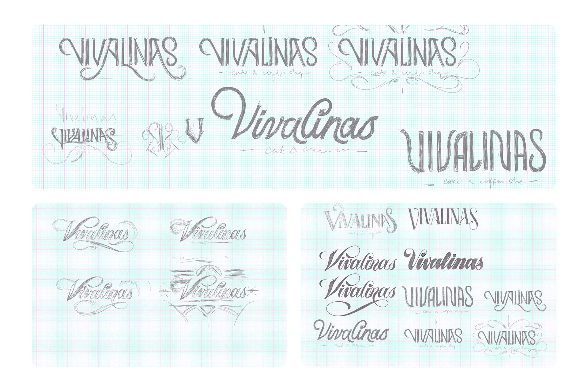
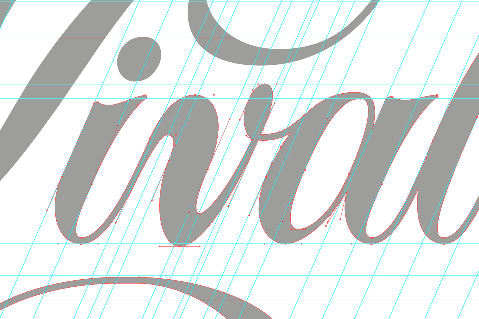
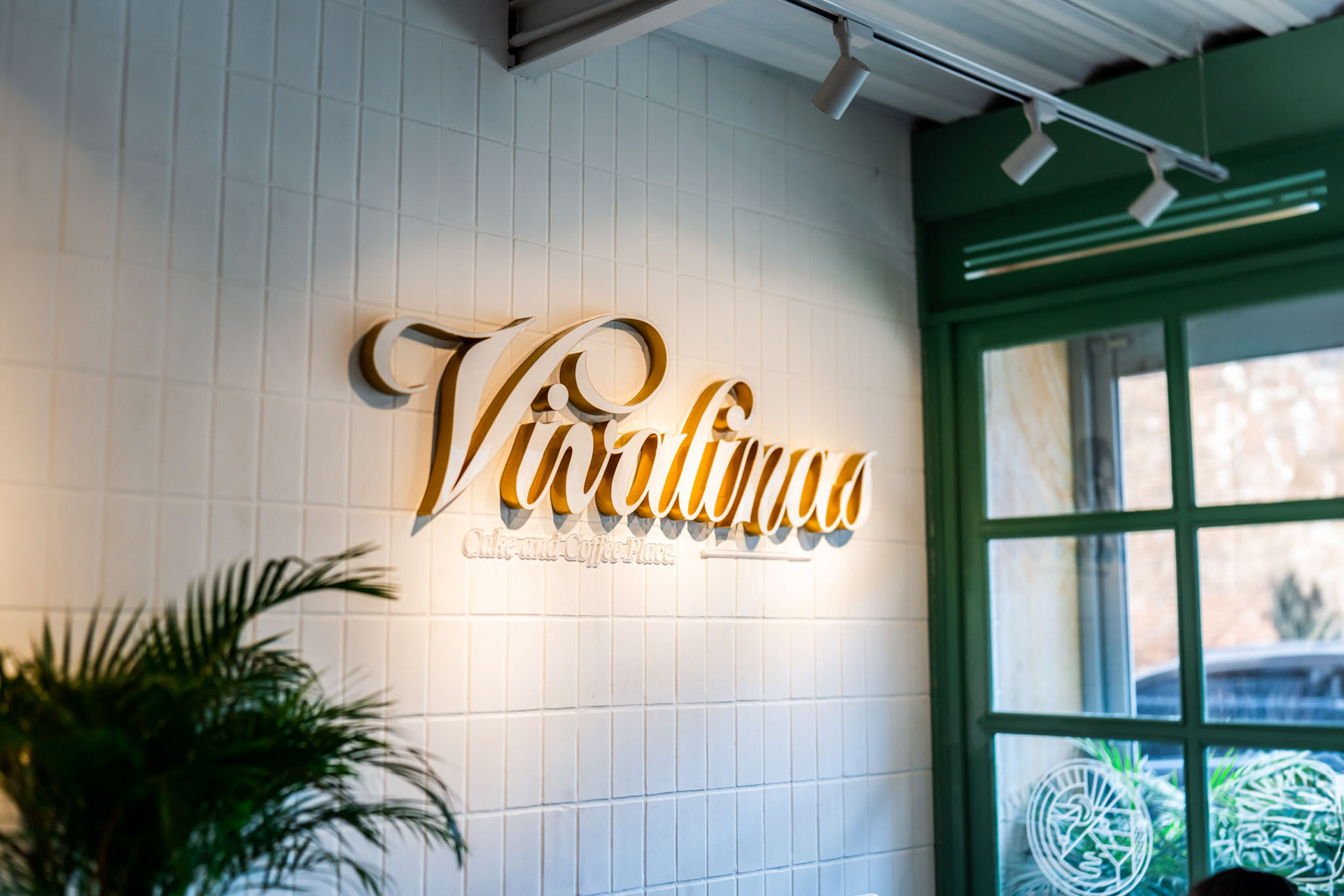
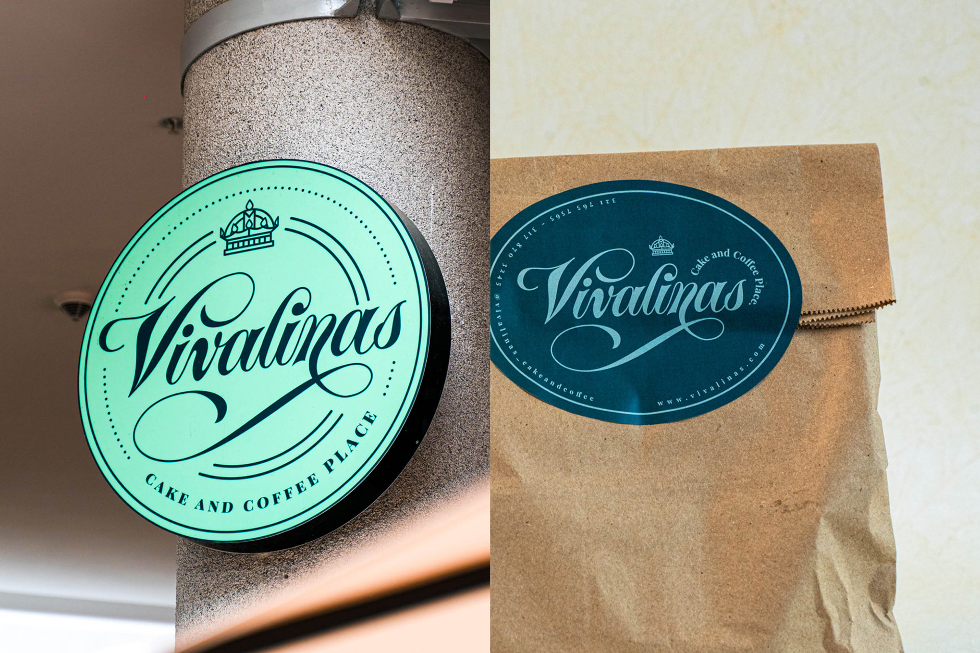
We updated the logo for better visibility, maintaining the script style of the previous version and incorporating Spencerian calligraphy for an English touch.
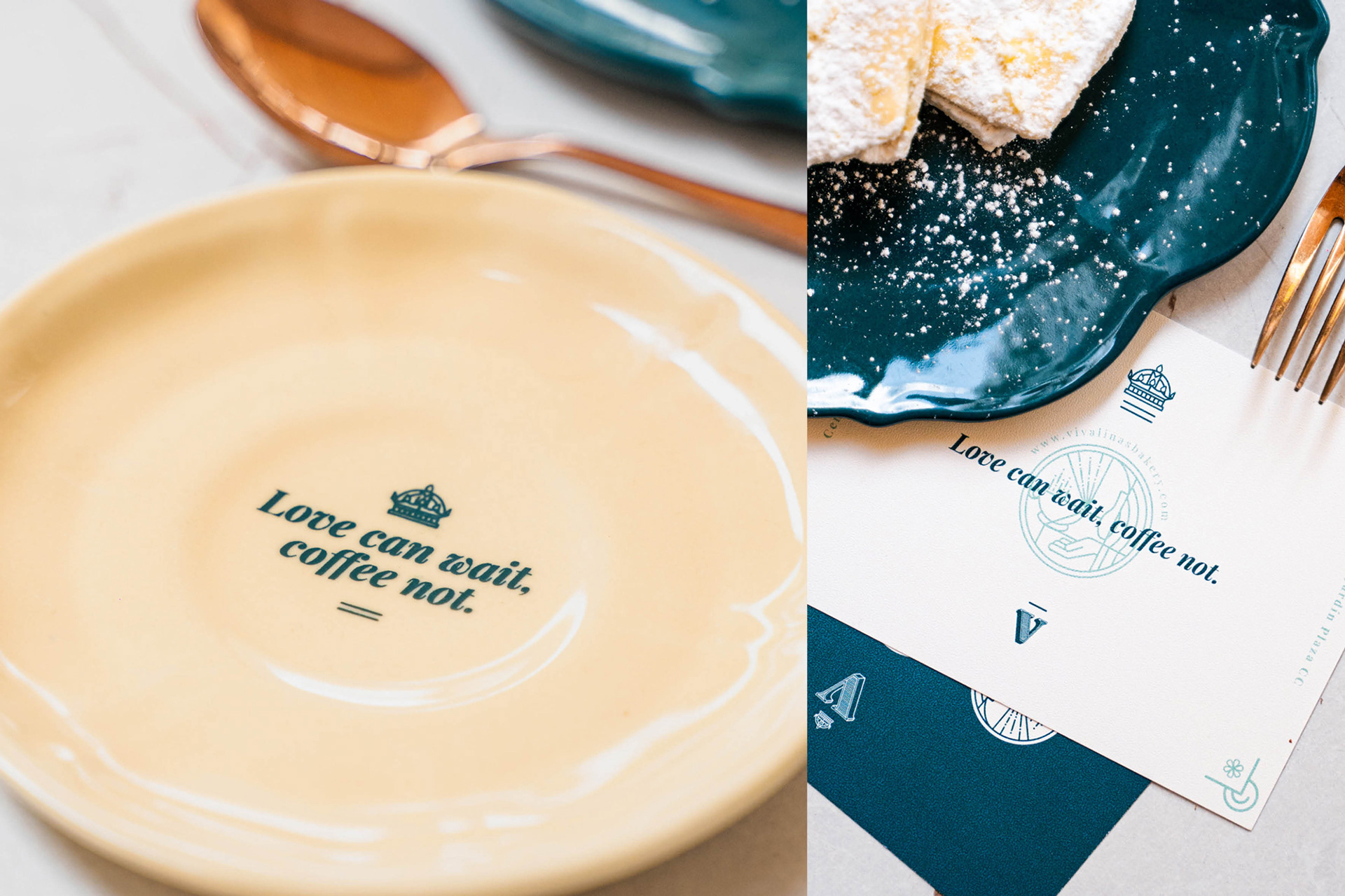
Additional graphic elements include geometric frames reflecting the art deco style and brand slogans that capture the brand's candid, romantic, and indulgent vision, such as "Love Can wait, coffee not".
The coffee shop caters to office workers seeking a quiet spot for rest, meetings, or simply to enjoy coffee and food. They can also use it as a serene environment for reading and responding to emails, or just to unwind from their hectic schedules. The brand aims to set itself apart from conventional cafes by offering a superior experience. It aspires to be a daring, luxurious, and elegant brand, with European influences, yet remaining expressive and simple.
Credits:
Interior Design: Alex Reyes (Opal Arquitectura Interior)
Copywriting: Daniela Díaz Lozano
Photography: Andrés Araújo
------
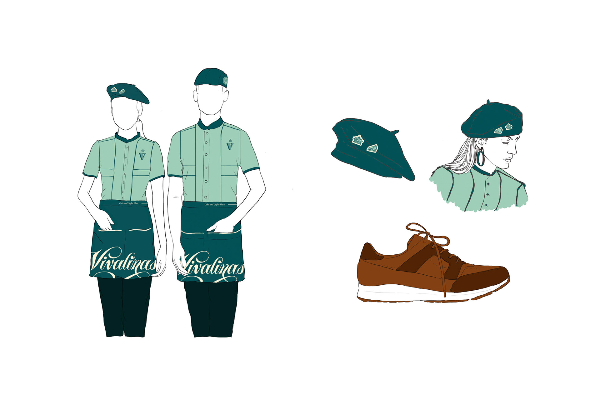
Brand identity / Copywriting / Lettering for logo / Illustrations / Packaging and stationery design / Costume / Archigraphy